
- Understanding Your Data Before Visualization
- How To Choose The Right Chart Type
- Choosing the Right Chart Type
- Basic Design Principles for Visualizations
- Simplicity and Strategic Whitespace
- The Importance of Branding in Data Visualization
- Effectively Communicating Insights
- Advanced Techniques for Experts
- Narrative Visualization
- Animated Visualizations
- Advanced Statistical Methods
- Mastering the Art of Data Storytelling
- Read more
Struggling to make sense of complex data? This data visualization guide helps you turn numbers into clear, compelling visuals for better decision-making and impactful storytelling.
In today’s data-driven world, understanding what is data visualization and how to present it effectively is crucial. By having a clear picture of what data visualization is, you will be able to turn complex data into clear stories, helping in making decisions and sharing insights. The real task is making these visuals both clear and compelling. This ultimate guide will walk you through perfecting the process of effective data visualization.
Understanding Your Data Before Visualization
Before creating a visualization, determine your main goals. Are you looking to inform, convince, or spotlight a trend? Your message’s core will guide the design of the visualization. It’s vital to deeply understand the data: its patterns, oddities, and general trends. Also, knowing where the data comes from and its limitations is key. After all, even the most striking visuals can be misleading if based on a misunderstood data set.
Consider this example: A prominent company proudly showcased a line chart with an upward trajectory, suggesting they were experiencing steady and consistent growth. At first glance, the chart powerfully conveyed their intended message, making it seem like they were achieving unparalleled success. However, a critical detail was overlooked: the effects of inflation.
The original data did not factor in inflation rates over the years. When these rates were taken into account, it became evident that the company’s growth was not as impressive as it first appeared – it was, in fact, only modest.
This incident serves as a stark reminder of how important it is to deeply understand and account for all underlying assumptions and variables when interpreting data. Any oversight, intentional or not, can lead to potentially misleading conclusions.
How To Choose The Right Chart Type
Learning how to choose the right data visualization can make a huge impact on how your audience interprets your information. The chart should fit your data and tell a clear story to the intended audience. Here’s a breakdown of the key factors to consider when selecting a chart type:
- The Audience: Understanding with who your talking to is crucial for effective data visualization. Different audiences require different levels of complexity. Data scientists may appreciate intricate patterns, while executives and non-technical users benefit from simpler visuals.
- The Purpose: Knowing the purpose helps you to find the best chart type. Bar or column charts are suitable for comparisons, line charts are best for tracking trends, histograms or box plots reveal data distribution, and scatter plots illustrate relationships between variables.
- Type of Data: Temporal data is best shown with line or bar charts and hierarchical data works well with treemaps, for example. Understand what you want to convey to choose the ideal type of presentation.
- Size of the Dataset: It affects chart selection. Larger datasets can overwhelm simple charts, necessitating more complex or aggregated visualizations to maintain clarity, for example.
When these elements align, your visualization is set to deliver an impactful story that’s clear, engaging, and insightful.
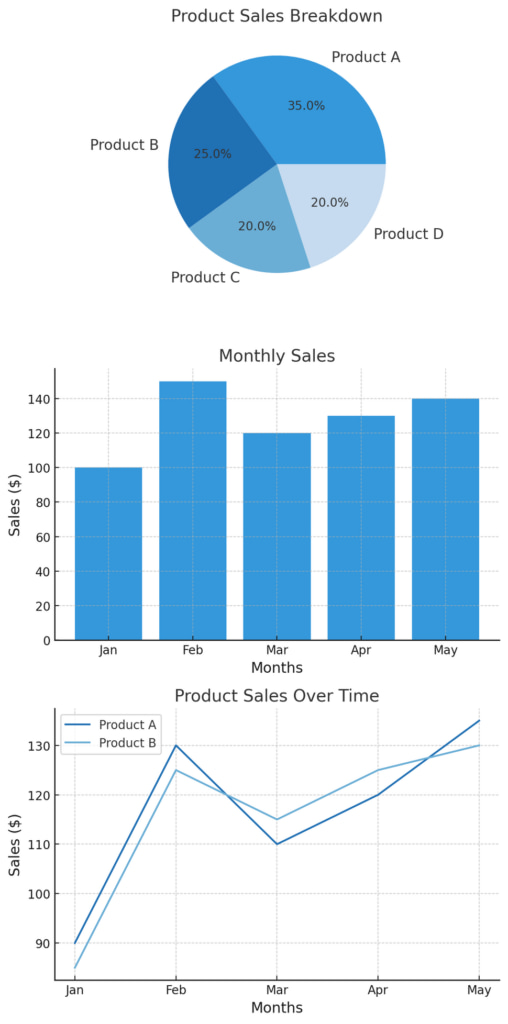
Choosing the Right Chart Type
Selecting the correct chart type is key to communicating your data’s story. Each chart type offers a unique way to display information. Let’s break down some of the most used charts, their functions, and examples of when to use them.
1. Bar and Column Charts
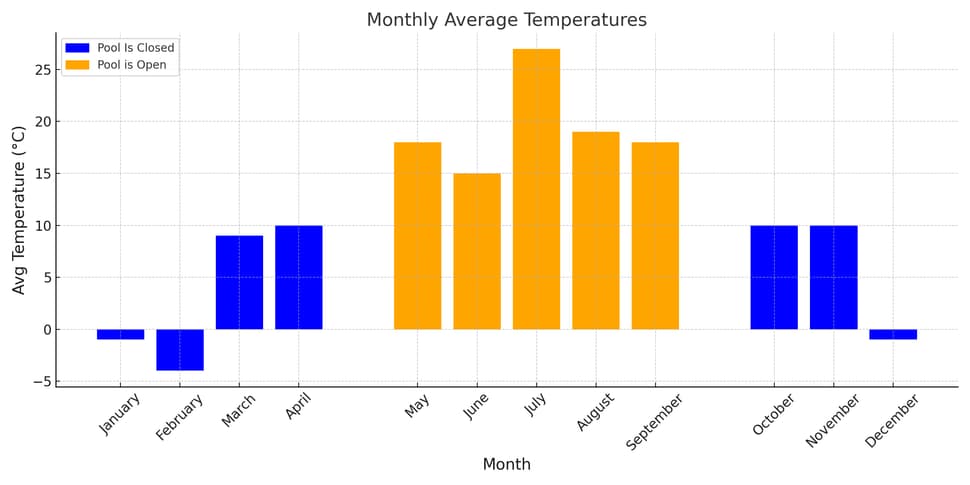
Bar and column charts are ideal for comparing individual categorical data points. For instance, sales of different products in a monthly temperatures.
- Example Use: Showing monthly sales figures across different product categories
- Tip: Bar charts are more effective for horizontal labels, while column charts work best when comparing vertical values.
2. Line and Area Charts
Line and area charts are perfect for tracking changes over periods. Think stock market trends or monthly temperatures.
- Example Use: Tracking stock prices over a year
- Tip: Use line charts for individual trend lines and area charts to show cumulative totals or highlight the volume of change over time.
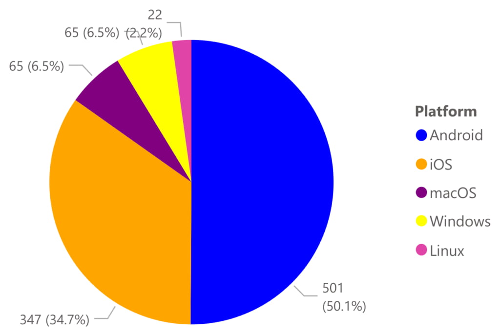
3. Pie and Doughnut Charts
Pie and doughnut charts can be used when representing parts of a whole, like market share percentages.
- Example Use: Market share by company or expense breakdown
- Tip: Keep slices to a minimum (usually five or fewer). Too many sections make the chart cluttered and hard to interpret.
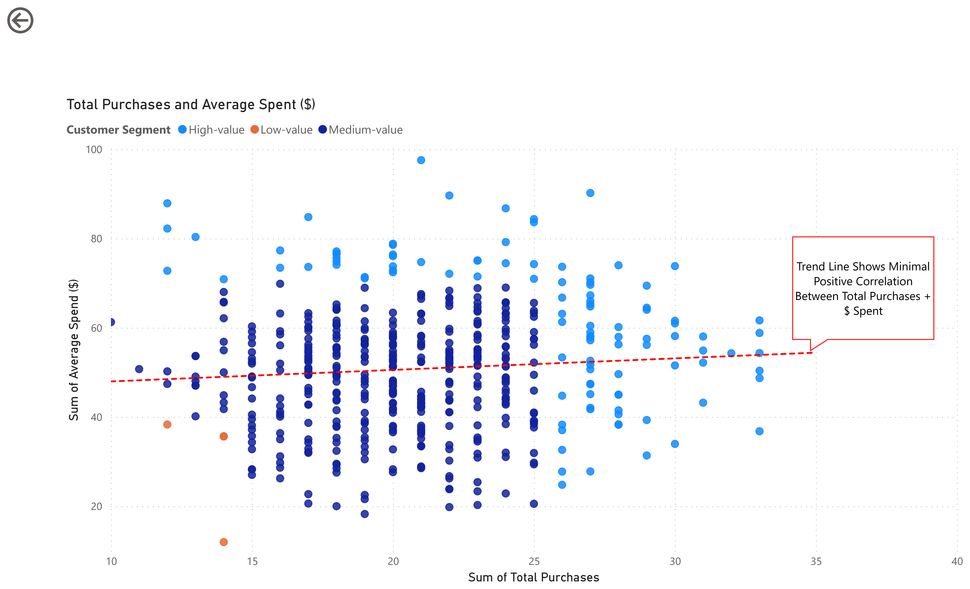
4. Scatter Plots
Scatter plots are used to show relationships between two numerical variables, such as height and weight.
- Example Use: Showing the relationship between advertising spend and sales
- Tip: For larger datasets, consider using a color gradient or marker size to represent additional variables, but avoid overcrowding the plot.
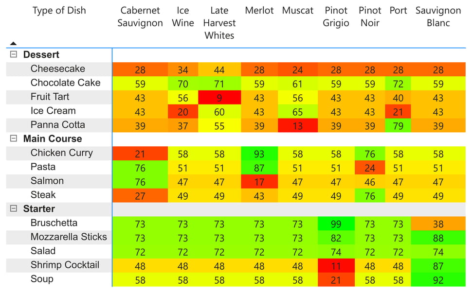
5. Heat Maps
Heat maps showcases data density or frequency. For example, website heatmap tools reveal which parts of a site users interact with most during different parts of the day.
- Example Use: Tracking website clicks or product popularity by region
- Tip: Use a consistent color palette to show intensities, making it easier for viewers to grasp the data’s concentration points.
6. Treemaps and Sunburst Charts
Treemaps and sunburst charts are great for hierarchical data, like a company’s organizational structure.
- Example Use: Displaying an organization’s structure or sales by region and product category
- Tip: Treemaps work well for datasets with multiple layers but fewer categories, while sunbursts offer a circular, radial representation for deeper hierarchies.
7. Geospatial Maps
Geospatial maps use spatial data for geographical data representation. Ideal for election results by region, for instance.
- Example Use: Election results by region or sales by state
- Tip: Keep map elements minimal to highlight critical data. Use color gradients or markers to represent density or value changes across regions.
Choosing the right chart type is essential in making your data engaging and easy to understand. By aligning your chart type with your data’s purpose, you create a more effective visualization that resonates with your audience.
Basic Design Principles for Visualizations
Good data visualization is pivotal in conveying complex data in an easy-to-understand format. While basic principles ensure clarity and comprehensibility, mastering advanced techniques can elevate your design, offering viewers insights at a glance. Let’s delve into some core design principles and their implications in practical scenarios.
Simplicity and Strategic Whitespace
Practical Implementation: Prioritize information by its significance. Filters and drilling down can help in showcasing data layers without overwhelming the viewer.
Challenge: Striking a balance between presenting all relevant data and ensuring clarity.
Advanced Technique: Use whitespace smartly. Whitespace can direct the viewer’s eye and emphasize specific data points. For instance, a bar graph that spaces out primary data sets can focus attention on critical trends while providing breathing room for understanding.
Mastering Color
Practical Implementation: Opt for harmonious color palettes. For categorical data, a diverging palette (like blue to orange) distinguishes data points without ambiguity.
Challenge: Color perception varies among individuals, especially those with color vision deficiencies.
Advanced Technique: Use tools to simulate how colorblind individuals perceive your visuals. For example, a pie chart that uses patterns in tandem with colors can ensure clear differentiation even if colors are indistinguishable.
Typography and Data
Practical Implementation: Choose fonts that are legible at varying sizes and weights. Avoid decorative fonts for critical data points.
Challenge: Ensuring readability across devices and resolutions.
Advanced Technique: Pair fonts that complement each other. For instance, using a bold font for titles and a lighter font for data labels can establish a hierarchy, guiding viewers through the visualization.
Consistency for Cognition
Practical Implementation: Utilize a uniform color scheme and typography across multiple charts in a dashboard or presentation.
Challenge: Keeping a consistent look without making visuals monotonous.
Advanced Technique: Introduce slight variations in shade or style for different sections or categories without deviating from the primary palette. For instance, a line chart tracking multiple data sources could use varying shades of a base color to represent each source, creating both distinction and cohesion.
Harnessing Interactivity
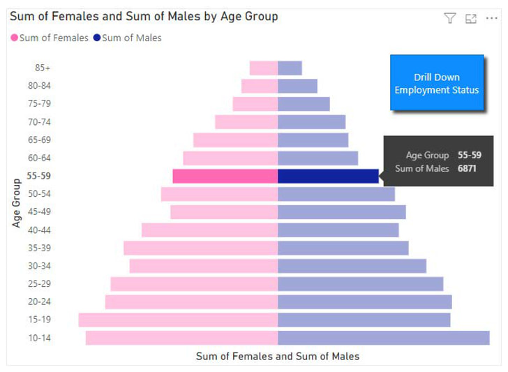
Practical Implementation: Implement hover effects, drill-downs, or tooltips to offer additional insights.
Challenge: Overloading interactive elements can confuse rather than clarify.
Advanced Technique: Prioritize interactivity based on user needs. For a population pyramid, hovering over an age bracket could show the exact population count, while a drill-down might display age-based demographics like employment status.
Incorporating best practices in data visualization, along with advanced principles, requires both aesthetic sense and an understanding of your data’s nuances. The goal remains to communicate clearly and compellingly. Use visual examples and iterative feedback sessions to refine your design continually.
The Importance of Branding in Data Visualization
Incorporating branding into data visualizations enhances both clarity and brand recognition. Aligning visual elements with your brand’s identity ensures consistency and strengthens your message. Key techniques include:
- Color Palette: Use brand-specific colors to create a cohesive look. This reinforces brand identity and makes visuals instantly recognizable.
- Typography: Select fonts that match your brand’s style. Consistent typography maintains professionalism and readability.
- Logo and Imagery: Incorporate your logo and relevant images to personalize visuals. This adds authenticity and aligns with your brand’s narrative.
- Data Presentation Style: Choose visualization formats that reflect your brand’s tone. For example, a tech company might use sleek, modern designs, while a non-profit might opt for more approachable visuals.
By integrating these elements, your data visualizations will not only convey information, but also reinforce your brand’s identity.
Next, we’ll explore how to effectively communicate insights through data storytelling.
Effectively Communicating Insights
Visualization is more than just pretty charts; it’s about conveying insights effectively, and this guide to data visualization will help you create visuals that are both memorable and impactful. Let’s illustrate this with an example:
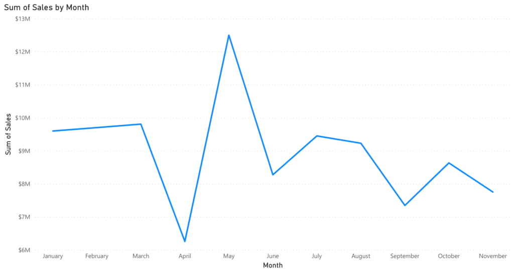
Before: Suppose you present a simple line graph showing the monthly sales of a company over a year. It’s a jagged line with peaks and valleys, but without any context, your audience might just see it as a series of ups and downs.
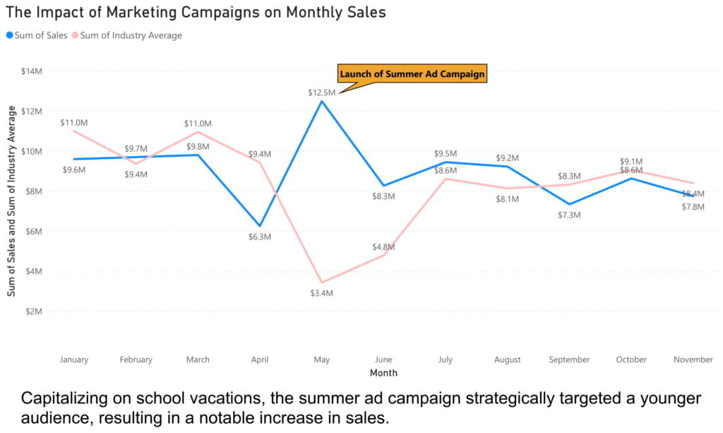
Narrative Storytelling with Data: The title of your graph is “The Impact of Marketing Campaigns on Monthly Sales.” Immediately, there’s a story. As your audience follows the data month-by-month, they anticipate and look for the influence of marketing campaigns.
Annotations and Highlights: You highlight a significant spike in sales in May with an annotation: “Launch of Summer Ad Campaign.” Now, instead of a random peak, there’s a clear reason for that increase.
Combining Visuals with Text: Below the chart, a brief textual explanation mentions that the summer ad campaign targeted a younger audience, capitalizing on school vacations, which led to increased sales.
Providing Context: You add a second, fainter line to the graph representing the industry average sales for each month. Suddenly, it’s evident that while the company’s sales saw a peak in May, the industry, in general, witnessed a dip, making the company’s achievement even more commendable.
In the ‘after’ version, not only is the visualization engaging, but the audience can clearly see the relationship between marketing efforts and sales, and how the company performed relative to the industry. The story makes the data memorable, the context makes it insightful, and the feedback ensures that future presentations are even more effective.
Advanced Techniques for Experts
For seasoned data visualizers ready to push the boundaries, here’s a dive into advanced techniques that promise to captivate and elucidate your audience.
Narrative Visualization
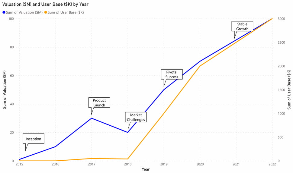
Practical Implementation: Use a combination of visuals, annotations, and textual cues to guide the viewer on a curated journey through your data. For example, if visualizing a company’s growth, begin with its inception, highlight challenges faced, and showcase pivotal moments of success.
Challenge: Ensuring the narrative doesn’t overshadow the data or make it misleading.
Advanced Technique: Implement a ‘scrollytelling’ approach, where the visualization evolves and unveils the story as the viewer scrolls through, offering a guided yet interactive experience.
Animated Visualizations
Practical Implementation: Use animations to demonstrate growth trends, shifts in market positions, or the flow of resources in an ecosystem. A moving chart showing the rise and fall of product sales over seasons can be much more impactful than static monthly bars.
Challenge: Overuse of animations can be distracting or even confusing.
Advanced Technique: Employ subtle animations with purpose – for instance, an animated flowchart where movements indicate processes or a time-lapse of a map showing migration patterns.
Advanced Statistical Methods
Practical Implementation: Techniques such as regression analysis can help in predicting trends, while cluster analysis can reveal hidden patterns or groupings within your data.
Challenge: Complex statistical concepts can be challenging for a general audience to grasp.
Advanced Technique: Visual simplification. If you’ve used regression analysis, for example, instead of showcasing all the data points and regression lines, you might choose to highlight only the predicted trends, making it intuitive for viewers.
Mastering the Art of Data Storytelling
Data storytelling is essential to making data meaningful. Rather than only showing numbers, good data visualizations tell a story.
This approach helps audiences spot trends, grasp complex information, and ultimately make better, faster decisions.
How can I get started?
Getting started with data storytelling might seem daunting, even overwhelming. But it can be surprisingly simple by focusing on a few foundational steps. Begin by defining your narrative and key objectives—what story does your data need to tell? Choosing the right visuals that align with your message is crucial, and adding context through labels, comparisons, or highlights helps your audience grasp insights more quickly. Thoughtful design, with consistent branding and colors, makes your presentation visually engaging and reinforces your brand identity.
In today’s fast-paced, data-driven world, the ability to tell clear, effective stories through data is invaluable. By combining thoughtful design, the right charts, and data storytelling techniques, your team can turn complex information into actionable insights.
Check out Codence’s blog for expert advice and start transforming your data into stories that drive results.
Read more
Subscribe to get the latest in your inbox

Built with you in mind
Speak to one of our expert consultants about making sense of your data today. During
this free consultation, we'll address your questions, learn more about your business, and
make some immediate recommendations.